Ui.Button
Basic button component that implements:
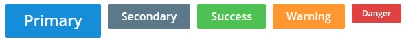
- 5 different types (primary, secondary, warning, danger, success)
- 3 different sizes (small, medium, big)
- focus state (with animation)
- disabled state
Interactions
Not disabled buttons take a Msg parameter, this is will be sent to the app when:
- The user clicks on the button
- The button has focus and the user presses the enter or space keys
Variations
Along with the standard view and render functions there are convenience functions for quick use: primaryBig, dangerSmall, etc...
Example Usage
This is just the relevant part of the example, see the full version here.
view : Model -> Html.Html Msg
view model =
  Ui.App.view
    App
    model.app
    [ Ui.Button.primary "Greet" Greet ]